Corporate Message
We face challenges with open minds to bring more smiles to life and joy in society.
We, the TOKAI Group, have been providing safe, secure, convenient, and comfortable services from the customer's perspective since our establishment in December 1950.
What supports these services are the "freedom of ideas" and "challenge power" of our group employees. Through new proposals born from this driving force, we will create a better life and a better society.
We will contribute to the realization of a sustainable society where people can have a brighter, more enjoyable, and energetic "smile" in their lives, spreading it to the community and society, and having dreams for tomorrow.
Brand
Corporate Logo
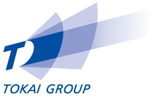
Light that brightens the future as well as synergy among TOKAI Group companies (overlapping beams of light)
The rays of light seen shooting diagonally upward from the capital T serves as the TOKAI Group's symbol.
The upper-right portion of the logo represents the future, where the Group constantly shines its light. Each Group company utilizes their unique strengths in order to realize our corporate philosophy, which states that we will continue to grow and develop together with both regional and global society.
An O shape can be seen between the T and the beams of light: this "TO" is short for TOKAI and also refers to the word "to," as in "to our customers," "to local communities" and "to the world."
The logo is displayed in Synergy Blue, our designated Group color and a color that brings to mind blue skies, seas and rivers. According to color psychology, blue symbolizes the future, hope and liberation, and thus expresses the TOKAI Group's goal of reaching out to the future and the world, expanding in scale as we go.
Corporate Slogan
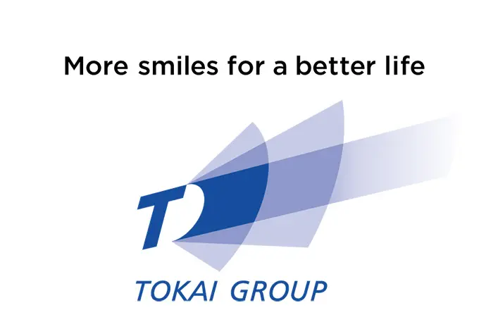
More smiles for a better life
The reason people smile is because of smiles.
To spread smiles in our lives and society, let's always wear a smile from us.
All employees of the TOKAI Group are determined to smile.